Evaluation of Betty Brown.
I initially created a brief such as Betty Brown to be able to create a brand and packaging designs for a cafe. However as I progressed through the brief I found that this was not really the design aspect I wanted to be in, and it also was not benefitting me nor was I able to create designs of which I had intended to through my final year. Therefore I decided to stop this brief and to swap my other main brief over the the DJ Branding which was much more exciting and I thought that I would be able to do a lot more with this brief and create things and do things I had intended; such as laser cutting and processes. I am glad that I stopped this brief when I did as it allowed me to concentrate more on other briefs and making those other briefs better as I had more time on them.
I have also learnt through this brief that I am not really into designing for such places as cafes and what I would call 'pretty' graphics where everything is made to look sweet and create a girly exterior. On the other hand I did create a logo eventually for this brief that I actually do like.
Showing posts with label Brief 2 - Betty Browns. Show all posts
Showing posts with label Brief 2 - Betty Browns. Show all posts
Sunday, 4 December 2011

Thursday, 17 November 2011

Wednesday, 16 November 2011


Tuesday, 15 November 2011


Tuesday, 1 November 2011

Open publication - Free publishing - More colour
I am still developing the logo, however I am trying to introduce some colour into the design to see if this enhances it or changes my view.
I am still developing the logo, however I am trying to introduce some colour into the design to see if this enhances it or changes my view.
For the Betty Brown logo I want it to have a pattern alongside the type.
It would have to be a wholesome pattern, which would remind you of things you do with family. Such as picnics or seaside hoidays.

Gingham was the first pattern that I thought about, however I am not entirely sure. I think it came to me because of my nana's homemade jams.

 I think it works better with the colour circle, although I am still not 100%

 I also don't think it works having the white type straight on the pattern as it is lost, and doesnt really stand out, which isn't what I was going for.
It would have to be a wholesome pattern, which would remind you of things you do with family. Such as picnics or seaside hoidays.


Monday, 31 October 2011
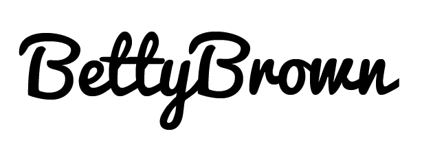
Betty Brown logo..
I really want to use this typeface as I think it will suit the design perfectly, although I want to edit it to fit both the first and second name together nicely without it looking a bit out of place.



Thursday, 20 October 2011
Open publication - Free publishing - More graphic design
Initial ideas for Betty Brown.. I want to create a brand and corporate identity for the cafe. I also want to create little packages and labels and menus etc.
I want to make this look and feel like an old fashioned cafe, homely and welcoming.
Initial ideas for Betty Brown.. I want to create a brand and corporate identity for the cafe. I also want to create little packages and labels and menus etc.
I want to make this look and feel like an old fashioned cafe, homely and welcoming.
Monday, 3 October 2011
Brief 2
Title: Betty Browns
Brief: Brand and create corporate identity for Betty Browns tea room
Background/Considerations:
- Target Audience 45-80 women
- Betty Browns tea room has been running for years and passed down generations
- Packages may be used as presents so may need the option of wrapping
Mandatory Requirements:
- Logo needs to express the look and feel of the brand
- Packaging needs to hold the logo
Deliverables
Logo/Branding
Packaging designs for a range of products
Title: Betty Browns
Brief: Brand and create corporate identity for Betty Browns tea room
Background/Considerations:
- Target Audience 45-80 women
- Betty Browns tea room has been running for years and passed down generations
- Packages may be used as presents so may need the option of wrapping
Mandatory Requirements:
- Logo needs to express the look and feel of the brand
- Packaging needs to hold the logo
Deliverables
Logo/Branding
Packaging designs for a range of products
Subscribe to:
Posts (Atom)