Monday, 31 October 2011

Betty Brown logo.. 

I really want to use this typeface as I think it will suit the design perfectly, although I want to edit it to fit both the first and second name together nicely without it looking a bit out of place. 


 I think this design above works the best out of this selection however I think I can make them fit nicer and stronger together.

 I really don't think having the Brown more left than the Betty works as it is then more confusing to read as your eye is firstly drawn to the word Betty.

I then want to print onto my bottle of the cleanser. To do this I have made design from the packaging to be printed straight on the bottle. I really hope this works as then I want to create a clear poster for the shop.

For the Betty brown logo I want to create a logo which looks hand drawn, yet quite bold and make the type the logo to be branded on all products etc.

Open publication - Free publishing - More book

I want to create a book with different layouts yet all link together, and be simplistically high quality. 
The first part I want to create is the book for the photographer.
I want to make experiment with the layout etc.


 For the wedding brief I have two sections.. One being the invitation design and pieces for the bride and groom. And then the high quality book and promo work for the photographer.


 Creating the final bands for the packaging. I really like the final designs as I think they will look really effective on the brown recyclable stock I have chosen for the  packaging. I want to keep these white as I think it will stand out and use keep printing down to a minimum making it more 'natural' and environmentally friendly.

Thursday, 20 October 2011


Open publication - Free publishing - More graphic design

Initial Ideas for the wedding brief.
Also after a crit they were really helpful and said I should split this down into two seperate briefs to make the most of everything I want to do..

For instance I want to promote the photographer and create promo material along with mailouts etc

Then I want to create wedding stationary; such as wedding invites, placements, table settings, favours, congratulations book etc. 

Open publication - Free publishing - More graphic design

Initial ideas for Betty Brown.. I want to create a brand and corporate identity for the cafe. I also want to create little packages and labels and menus etc.

I want to make this look and feel like an old fashioned cafe, homely and welcoming. 

These are the designs for the bands for my packaging. I wanted to create something different for a body shop package rather than the usual same type on top of an image.

I quite like the idea of using an off white/cream colour for the packaging using a really good stock then having the white band with black type around it. I think this will show the 'natural/ high quality' look I wanted

Open publication - Free publishing - More graphic design

Packaging mock ups for the design I am going for. I want the packages to be sophisticated and simple and keep them elegant. I want to find a really good stock to make them out of then use the stickers to create the band. 

Thursday, 13 October 2011

I am not keen on the label design, although it does make it slightly more feminine I am not a fan. I want to create some designs which look sophisticated and incorporate the idea of it being natural. I am thinking maybe using laser cutting ideas for the packaging or the possibility of embossing the body shop logo

This is one of my designs for the label on my packaging. I want to have this black and white and then have the stock possibly a deep cream colour, however I am going to try with I few different colours to see which I like best.

Wednesday, 12 October 2011


Open publication - Free publishing - More colour

I wasn't sure if the sticker for the side of the packaging would need colour on it? SO I tried a few pastel colours for keeping it within the idea of 'natural' however I am really not sure with these. But I am going to print them and see what they look like against the brown packaging. 

Tuesday, 11 October 2011


I have decided to see if the idea of using a design around the type may look better as I think the type looks quite manly on its own; and the target audience is women.

I am not sure this quite works, I think I may need to play around with the thickness of the line, but out of the three I prefer this first design.

I also thought that if I make this design really work this would give me a wider range of ideas for my stock for the packaging. Although I want to try both.

Thursday, 6 October 2011


This is the type designs I want to have on the packaging and also the bottles themselves.

I want to use glass bottles as I think black type on glass will be really effective, also it will look like more of an expensive product/ worth paying for if it is also better for your skin.


I havn't as yet taken the design onto the actual bottles themselves. When testing it on screen, I wasn't sure about putting a colour banner on a bottle as I think it would look odd. I then thought about maybe just using the type on the bottle.. Such as this black type on the left, and I quite like this idea!

Using the black type on the bottle has then made it less fussy/childish looking and made the product look and feel a bit more expensive.

However I wouldn't then want to use the colour on the outside packaging, therefore I am thinking of stripping it right back to using a really good stock and black type, which I think will look and feel 'natural'.

Wednesday, 5 October 2011


These are the typographic designs I am looking at creating, however what I now want to test is wether the whole packaging should be in colour or wether I should have a band of colour and the packaging maybe white? or frosted? I am not sure!


Im not sure I like the white packaging and the strip of colour.. But I may have to physically make them, as they may look better when made.


Open publication - Free publishing - More colour

Deciding on colours for the packaging design. In my opinion you would want a cool maybe blue colour for the cleanser, green for the toner and maybe a cream colour for a moisturiser. For a fragrance I am not sure as yet what colour I would relate with it. 

Tuesday, 4 October 2011


Open publication - Free publishing - More body shop

Ideas for the products and range for the packaging designs
Brief 1: Body Shop

Experimenting with the layout for the packaging.

I really want the Natural Collection to be in a different font as to stand out, however Im not certain wether to do it completely separate, as I don't think these designs are working.
I quite like having the Body Shop logo at the top of the design, However this doesn't contain the Natural Collection! So what I am thinking is doing a completely separate design with the Natural Collection phrase on. Maybe like a black circle with the type in?


 This design has the Natural Collection phrase on however I dont think it stands out enough to be used as a sub branding within Body Shop to be able to put on a range and be noticed.

Open publication - Free publishing - More colour

Few colour palettes which caught my eye, quite random colours together but would work well on the packaging to convey the feminine packaging along with the natural essence 
Brief 1: Body Shop

This would be how the type would fit in to all the different products


But I am not a fan of the colour in the background.. As what I am thinking is having the type white, with a colour background to match the pattern I will put as the background.

Brief 1: Body Shop


I do not know wether to use a base colour then change the colour for the different products? So i could use a pink colour for a moisturiser, possibly more blue for cleanser etc.. Or I may try using a pattern as the background.
Brief 1: Body Shop

NEW idea.. I think I am going to use the type I have come up with in pastel colours to show it is a feminine product, however I want to make a pattern to accompany it, as I think the product would look slightly plain without it.


What I could do instead of using the photographs on the packaging, is to maybe make a pattern from these photographs, and have the designs in pastel shades.
Brief 1: Body Shop

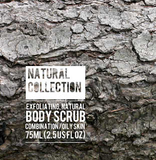
I have used my initial idea within these designs of using the picture behind the text, and although I thought maybe the second idea with the Natural Collection in a different font was better, it doesn't work as well on top of the photograph?! 


Although I do really like this design I'm not sure that it says anything about a feminine product as it is too bold.. I like the idea of the bark being used for an exfoliant however im not sure this works so well. 

Brief one: Body Shop

Packaging design, I am unsure wether the title of 'Natural Collection' should be in a different font or wether it looks good fitting in with the description of the product? 


I quite like this idea of having the 'Natural Collection' in a separate design as this can then be put on all different designs for the products and then link them together as a collection.  

I am not certain on this design I don't think this design really works! 
 I really like the layout of the type above I think it will work really well on the packaging with its shape.. Although I dont like the colour of this design.
 Although I like the cream colour better, I am not certain if I would have the title in with the description or wether it would look better seperate and possibly in a different way.


I want to use type effectively on my packaging. I really like the idea of everything fitting in line with each other as I think this will look really good on square packaging.. However I am not sure wether to have just the description of the product in line and have the title 'natural collection' in a different type. 

Open publication

I wanted to chose a sans serif font as to produce quite a clean, simple font to show the 'natural' side of the products. 
Brief one: Body Shop Packaging

Initial Ideas:

I want to create a range of packages for a: cleanser, toner, moisturiser, loufe, fragrance and cloth
I am thinking box packages along with the bottle as I want them to look more expensive/ higher quality products.
Also I want to use image alongside text and it could be a pattern or a picture..

Maybe could use photography of natural things to express the product..

For example use the bark image for an exfoliator?
An image of blue sky for a cleanser? That sort of thing.. Then use type to explain the product.

Monday, 3 October 2011

Brief 3

Title: Wedding Stationary

Brief: To create promotional material for a wedding photographer

Background/Considerations:

- Keep it creative using the photographs from the weddings.
- Make it look expensive/ high quality
- Must include the links back to the photographer
- Mail out would be ideal way to promote the photographer so how would you package the information?

Mandatory Requirements:

- Must be modern and creative
- Contains a variation of images yet work as a set of designs
- Make the photographs the main attraction and use the layout to enhance them.

Deliverables


 Creative Mail outs
- Leaflets
- Posters/adverts for windows
- Book of images
- Packaging for Prints
Brief 2 

Title: Betty Browns

Brief: Brand and create corporate identity for Betty Browns tea room

Background/Considerations:

- Target Audience 45-80 women
- Betty Browns tea room has been running for years and passed down generations
- Packages may be used as presents so may need the option of wrapping


Mandatory Requirements:

- Logo needs to express the look and feel of the brand
- Packaging needs to hold the logo

Deliverables

Logo/Branding
Packaging designs for a range of products
Brief 1 

Title: Body Shop

Brief: Design a contemporary range of packaging for a range at Body Shop

Background/Considerations:

- Target Audience 18-35 women
- Designs must express the ethical and natural qualities of the brand
- There are 4 ranges focussing on: skin, fragrance, make up, moisturiser

Mandatory Requirements:

Use the Body Shop logo on the packaging
Design for a rang of products

Deliverables

Packaging designs for a range of products

Sunday, 2 October 2011


Initial Ideas for the Body Shop Packaging. I want to create a wide range of designs for various different shapes of packaging that may be in the collection.